14 May PAV-DT: Map-based user interface: Visualized data sets and interactive UI
Nowadays, web applications offer different kinds of software to create an interactive experience for the user. A common feature which can be seen on many websites or web applications is the Google Map API. It offers an interactive way to analyse, sort and select data which is to be presented to the user. On the PAV-DT web application, this powerful API was used to enable a rich and interactive way of navigating through visualized data sets such as near real-time and historical data.
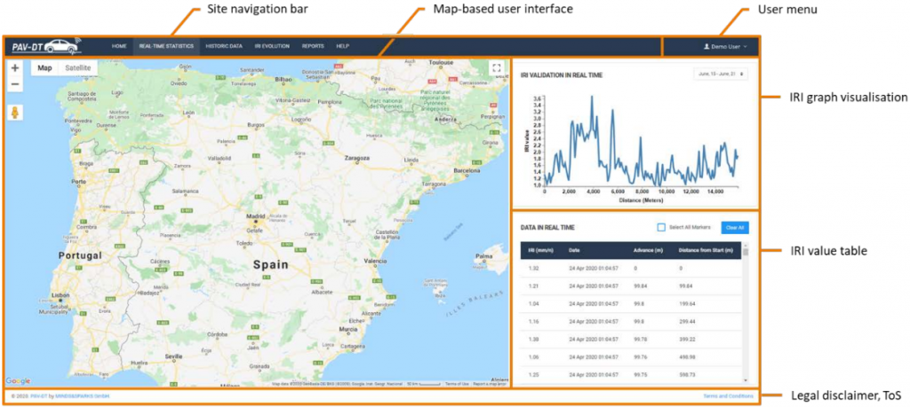
The user interface for map-based views follows a consistent structure. At the top of the screen is the main navigation bar to switch between aforementioned operational views. The user context menu is accessible from the top right. The main screen area consists of the map view, which comprises of a selectable basemap and an overlay of the IRI- (International Roughness Index) and position data related to the selected view. The right side of the user interface consists both of a graph view (value and distance) and a table presentation of the IRI values.
Zoom capabilities: The user can control the zoom level either by using the +/- button on the right side of the screen, or by utilising the mouse wheel. Depending on the zoom level, a different level of detail of the objects on the basemap is provided, on a high zoom level, only capital cities and the main highway networks are displayed, while a close up zoom also displays and labels smaller villages, and regional or local parts of the road network.
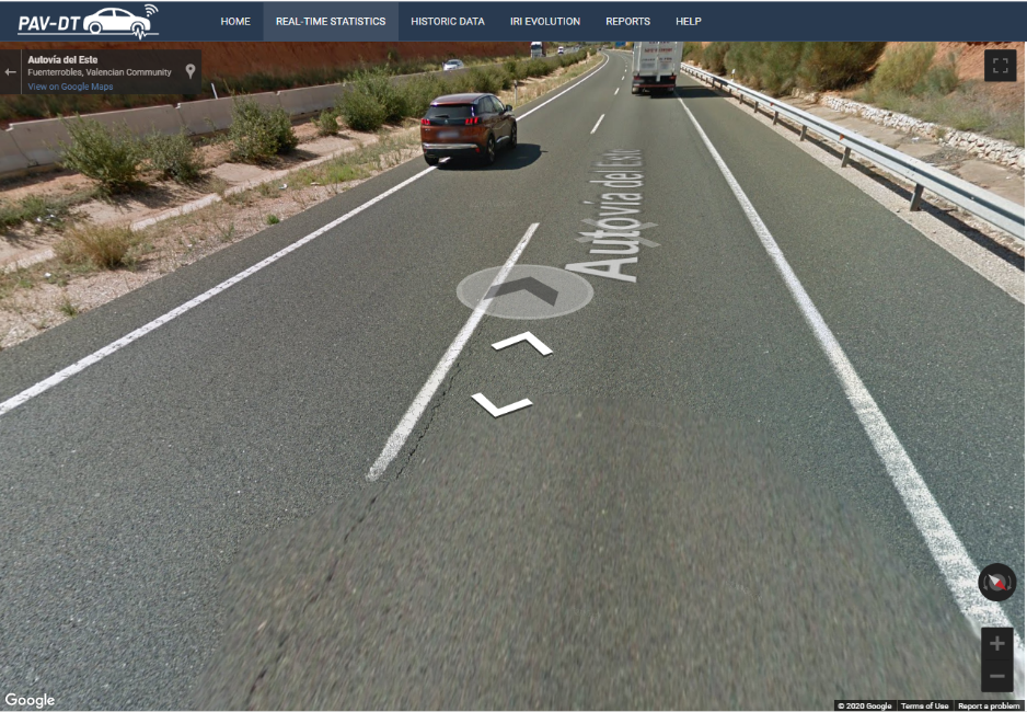
Google Street View integration: The functionality of Google Maps to display an interactive first-person perspective for a selected spot on the map has been integrated in the map view of the frontend, as it can provide additional information about the local circumstances for a specific road segment. The controls of the view are directly integrated from the API, and support an input via on-screen buttons, keyboard cursor keys, dragging the view with the left mouse button, or jumping to a spot via double-clicking.
Mouse controls in the map user interface: In addition to the aforementioned capabilities, the map view supports intuitive mouse controls, such as panning the view via the left mouse button, zooming to and centre on a location by double clicking, or controlling the zoom level via the mouse wheel.
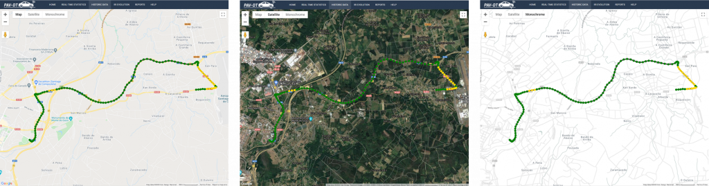
Basemap selection: The user can switch between different basemaps to aid in the visualisation. Next to the satellite image and topographic basemap, a high contrast basemap has been added to further increase the visibility of IRI measurements. The default basemap on launching the application is the topographic view without a terrain overlay.
Near Real-time Data View
The real-time view presents the user an option to select active vehicles equipped with hardware units and displays the measurement of the selected vehicle in near real-time. The implementation creates a trace for the selected vehicle, starting from the initial starting position of the measurement, and is increased in increments of 10 meters in 1 second intervals, which is the equivalent of 36kph and as such realistic for an urban environment.
Historic Data View
To accommodate for the additional data on defects, the user interface was restructured to maintain a clean, uncluttered overview. The user interface view contains two separate tables for IRI values and defects, which can be expanded by clicking on the plus sign next to the table description. This will automatically collapse the other table. For defects, a button was implemented to toggle the map overlay of icons. Similar to the IRI values, the defects table provides the functionality for generating an Excel report.
In addition to the IRI visualisation, the retrieval of defects information was implemented. The API response encompasses the GPS position, advance and value, alongside the type classification for “potholes” and “bumps”. The map-based visualisation of defects can be toggled by the user, in which case it is layered above any existing datasets already visualised. Vector icons were created for both types of defects to improve the visualisation in the map view.

IRI Prediction View
The business purpose of the IRI prediction view (“IRI evolution” in the frontend) is to display the anticipated degradation of a road in a one-, two- and three-year prediction, which are based on a calculated model in the ackend environment, and provisioned via an API endpoint. The user interface structure is consistent with the historic- and real-time view, but was expanded with specific functionalities and an extended visualisation to support the use case. The user interface flow is also similar to the historic view, prompting the user to select a road to display the values. Upon selecting a road, the prediction values are retrieved with a separate API call. The returned values allow constructing an array of the advance and GPS coordinates, which are static for all time periods, and the individual IRI values for each time period. The user can switch between the current and projected datasets via buttons at the top of the map view.
A colour scheme was defined for a presentation of the four values, which is consistent for the selection button, the graph and the map visualisation. The user interface is extended with four buttons to switch between the current and prediction data visualisations. In the graph presentation, all four values are displayed at the same time, to provide a consolidated overview of the expected degradation. The colour scheme for the visualisation is configurable, the default configuration is designed to accommodate for colour-blindness.
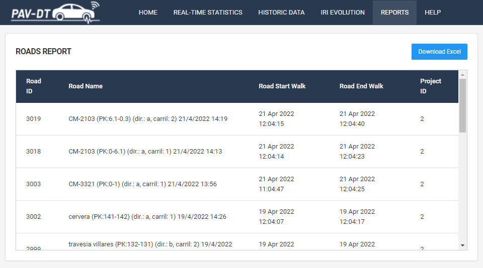
Excel Reports
In order to further evaluate or use the data extracted from the API, an export function was implemented which downloads the reports as an excel sheet. Specific datapoints may then be extracted and analysed using any sort of external software for further specific use.